Widget Customization
Customize every aspect of how your chatbot appears and behaves on your site. Navigate to Settings → Widget Customization to configure these six sections:
- Style & Appearance
- Preview Message
- Full Page
- Widget Interface Language
- Widget Availability Schedule
- Custom Styling
After making changes, click Save Changes in each panel to apply them immediately.
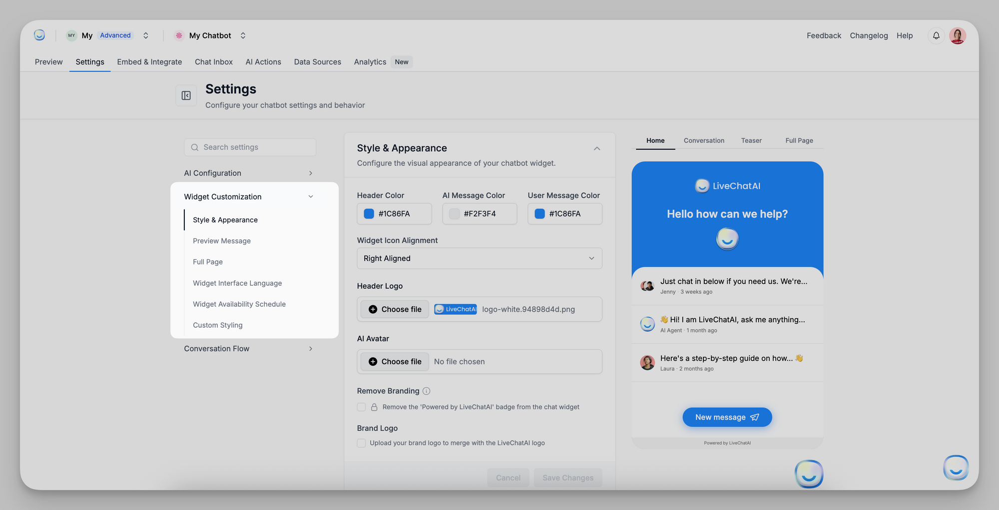
Style & Appearance
Control the visual look of your embedded chat widget (when used as a Messenger or inline chat).
- Header Color: Pick the hex or use the color picker to set the top banner color (e.g., #1C86FA). This color appears behind your header logo and title.
- Text Color: Choose the color for chat messages and text labels inside the widget.
- Background Color: Set the chat window’s background area color. This is visible behind messages and in the page’s blank regions.
- Widget Icon Alignment: Select Left Aligned or Right Aligned to position the floating launch icon on the user’s screen.
- Header Logo: Upload a PNG or JPEG (transparent background recommended) to replace the default “LiveChatAI” logo in the widget header.
- File guidelines: up to 2 MB, dimensions around 200×50 px for best fit.
- AI Avatar
Upload a 1:1 avatar image (e.g., 100×100 px) for the bot’s contact icon next to its messages. If left blank, the default logo is used. - Remove Branding (checkbox)
Enable this to hide the “Powered by LiveChatAI” badge at the bottom of the widget. (Note: Only available on paid plans.) - Brand Logo (checkbox + upload)
If checked, you can upload your brand’s logo. This merges your logo with the LiveChatAI logo in the header for co-branding.
Save Changes after updating any field.
Preview Message
Show a friendly teaser before users open the chat and define how the bot refers to itself.
- AI Agent Name
Enter how the bot identifies itself in chat (e.g., “SupportBot” or “LiveChatAI”). This name appears above any automated message previews. - Welcoming Text
Text displayed in the initial bubble before the chat is expanded (e.g., “How may I help you?”). Keep it concise. - Hide Teaser Message (checkbox)
When checked, the teaser bubble is hidden—users see only the widget icon until they click it. - Teaser Message
This message shows inside the bubble before the user expands the chat (e.g., “👋 Hi! How can I help today?”). It should encourage interaction.
Full Page
Configure your standalone, full-page chatbot experience (when using the “Full Page Chat” embed).
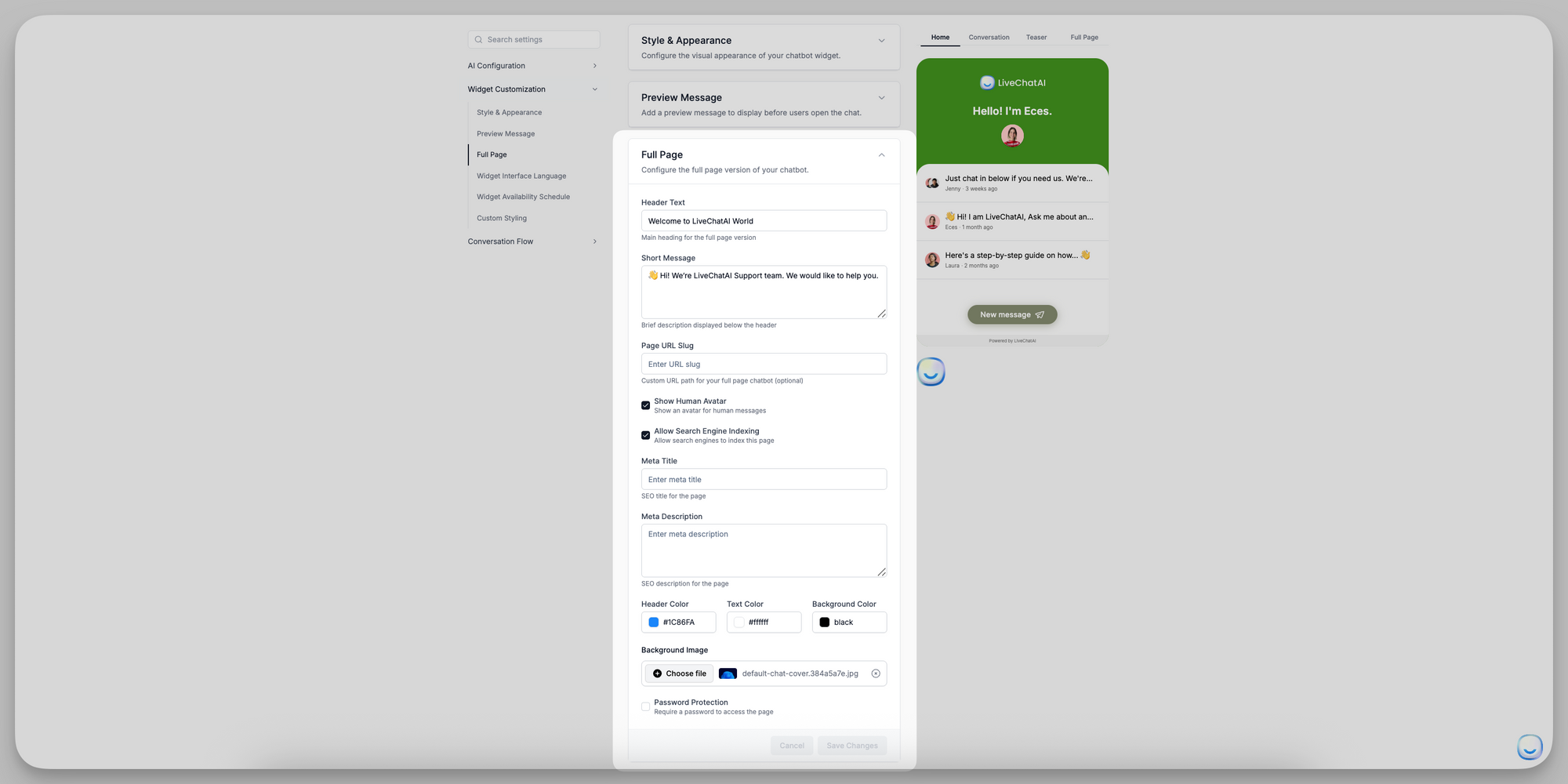
- Header Text: The main headline at the top of the full-page layout (e.g., “Welcome to LiveChatAI World”).
- Short Message: A brief subheading or description below the header (e.g., “👋 Hi! We’re LiveChatAI Support team. We’d love to help you.”).
- Page URL Slug: Define a custom path for your full-page chat (e.g., livechatai → accessible at https://app.livechatai.com/livechatai). If left blank, a random slug is assigned.
- Show Human Avatar (checkbox)
When enabled, displays a human avatar next to any replies passed to a human support agent. - Allow Search Engine Indexing (checkbox)
Enable this if you want Google and other search engines to index your full-page chat as a webpage. - Meta Title & Meta Description: Meta Title: SEO title for this chat page. Meta Description: SEO description for search results.
- Header Color / Text Color / Background Color: Same color pickers as Style & Appearance, but applied to the header bar, text, and overall page background of the full-page view.
- Background Image: Upload a banner image (e.g., 1200×400 px) that appears behind the header text on the full-page chat. (Supported formats: JPEG, PNG (≤ 2 MB).)
- Password Protection (checkbox): If checked, visitors must enter a password to access the standalone chat page. After enabling, enter the desired password in the field that appears.
Widget Interface Language
Set the language for all widget UI elements (buttons, labels, menus). The chatbot’s responses can still be in any supported language.
- Default Language: Choose the primary interface language (e.g., ENGLISH, SPANISH, FRENCH, etc.). This controls the text on buttons like “Send,” “Close,” and menu actions.
- Enable Auto Translation (checkbox): When enabled, the widget will auto-detect a visitor’s browser language and switch UI elements accordingly.
- Supported Languages: Click Add Language to include additional languages the widget can auto-detect. Each added language ensures UI translations even if the visitor’s browser is set to that locale.
Widget Availability Schedule
Control when the chat widget appears active on your site. (This does not affect human or AI uptime—only the widget’s visibility.)
- Enable Schedule (checkbox)
Turn this on to define specific operating hours. - Timezone
Select the timezone that your operating hours reference (e.g., “America/New_York”). - Operating Hours
- Every: Choose a daily or weekly pattern (e.g., Every day, Mon–Fri, Sat–Sun).
- From / To: Set the time range (e.g., 08:30 → 17:30).
- Click Add Schedule to set multiple blocks (e.g., Mon–Fri 08:30–17:30 and Sat 09:00–12:00).
If no schedule is defined, the widget remains visible 24/7.
Custom Styling
Add your own CSS to fine-tune the widget’s appearance beyond standard settings.
- Custom CSS
Paste any valid CSS selectors and rules here. This CSS is injected into the widget’s iframe, allowing you to override styles such as font sizes, margins, or colors not covered by the built-in controls.
Warning: Incorrect CSS may break widget styling—test thoroughly on a staging site first. Click Save Changes to apply your custom styles.
Summary
- Style & Appearance: Visual theme, logos, and branding.
- Preview Message: Teaser bubble text and AI name.
- Full Page: Standalone chat page header, slug, colors, and SEO.
- Widget Interface Language: UI language and auto-translation.
- Widget Availability Schedule: Hours when the widget is visible.
- Custom Styling: Advanced CSS overrides.
Review each section carefully and click Save Changes to ensure your customizations appear live. For any questions, email [email protected].